XYPN Brand Refresh
XYPN helps independent, fee-only financial planners to build their businesses with subscription-based pricing built in. After a decade on shoestring branding that had outgrown its rebellious roots, the idea of fee-only financial planning began to gain traction across the industry. It was time for XYPN to own their expertise.
Client
XYPN
Industry
B2B
Role
Branding
Identity
Strategy
Year
2024–26

As the idea of fee-only financial planning gained traction, it was time for XYPN to own their expertise.
Brand strategy
Founded as a movement of financial planners looking to change the industry, early marketing focused heavily on revolutionary language with an irreverent voice. Evolving that brand for mainstream adoption called into question a whole host of strategic choices.
We began with a brand personality centered around the Magician archetype. This counterintuitive choice for a company catering to detail-oriented spreadsheet-lovers differentiates XYPN in an industry of Sages, and reframes the leap of entrepreneurship to the magic of adventure.
Emphasizing approachable authority, the first tagline became “Make it possible,” a testament to the brand that coaches, inspires, and empowers financial planners.


With a loyal base of early adopters, it was crucial to evolve the brand without undermining its equity.
Identity
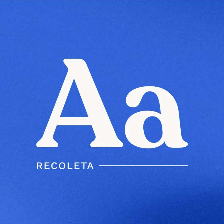
The XYPN combination logo was built on the Recoleta typeface ↗ along with an ownable logomark. Choosing a wonky, playful, human serif helps XYPN stand out in the field of fintech sans serifs and stuffy, old-school serifs, conveying approachability and authority. The arrow in the negative space of the logomark brings a sense of movement, and gives a nod to the team's roots in moving the industry forward.


Visual language system
The visual language system combines simplified versions of familiar brand elements with new visual vocab, elevating XYPN without losing its history or humanity.
Color & Type
Saying sayonara to the primary school hues, the updated palette built on the brightness of the brand, maturing the visual language. The founders’ attachment to a blue and green combo ran deep, so we prioritized a recognizable palette that leaned into blue as the primary while using a spring green as the accent.
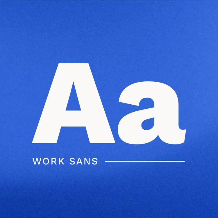
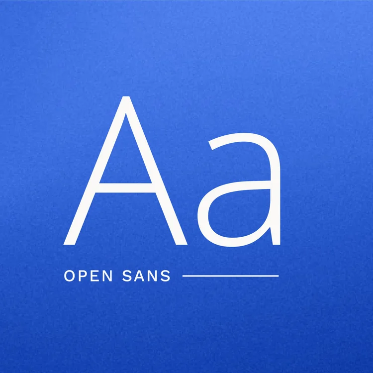
Recoleta is the primary display typeface, bringing a soft wonkiness that humanizes the brand in a sea of sans serifs. Work Sans is the secondary display typeface. The grotesque-inspired family combines modern polish with a friendly candor. Open Sans serves as the old reliable with a hint of the humanist.
Blueberry
Pistachio
Indigo Girl

Brand collateral
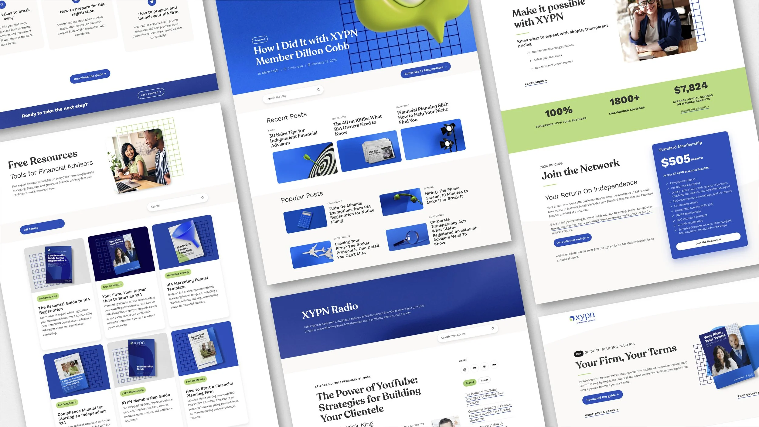
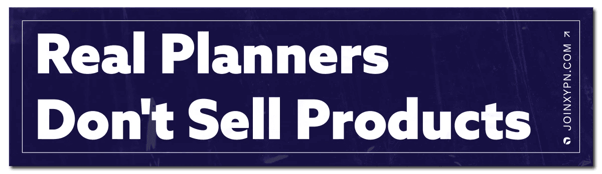
For brand extensions big and small, we regularly returned to the concept of approachable authority. With a focus on empowerment, I featured faces whenever possible, shooting for a candid, honest style. From ebooks to podcast art, I updated countless assets for the updated brand launch. While consistency is crucial, each piece presents an opportunity to iterate.






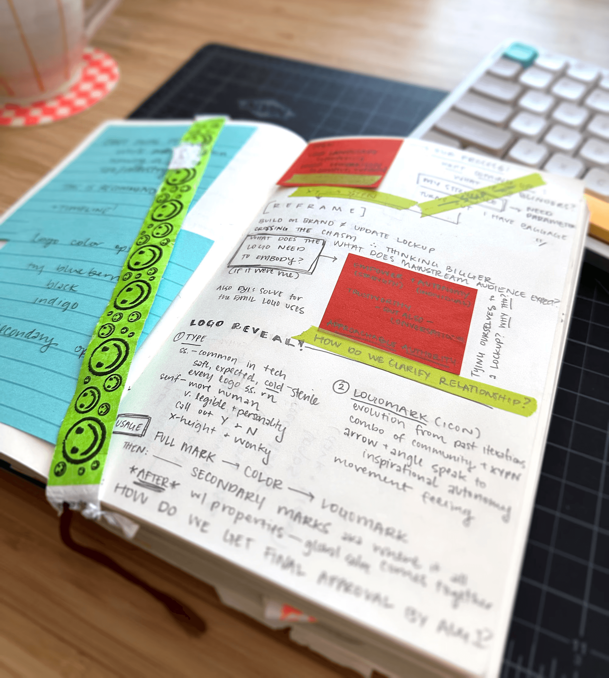
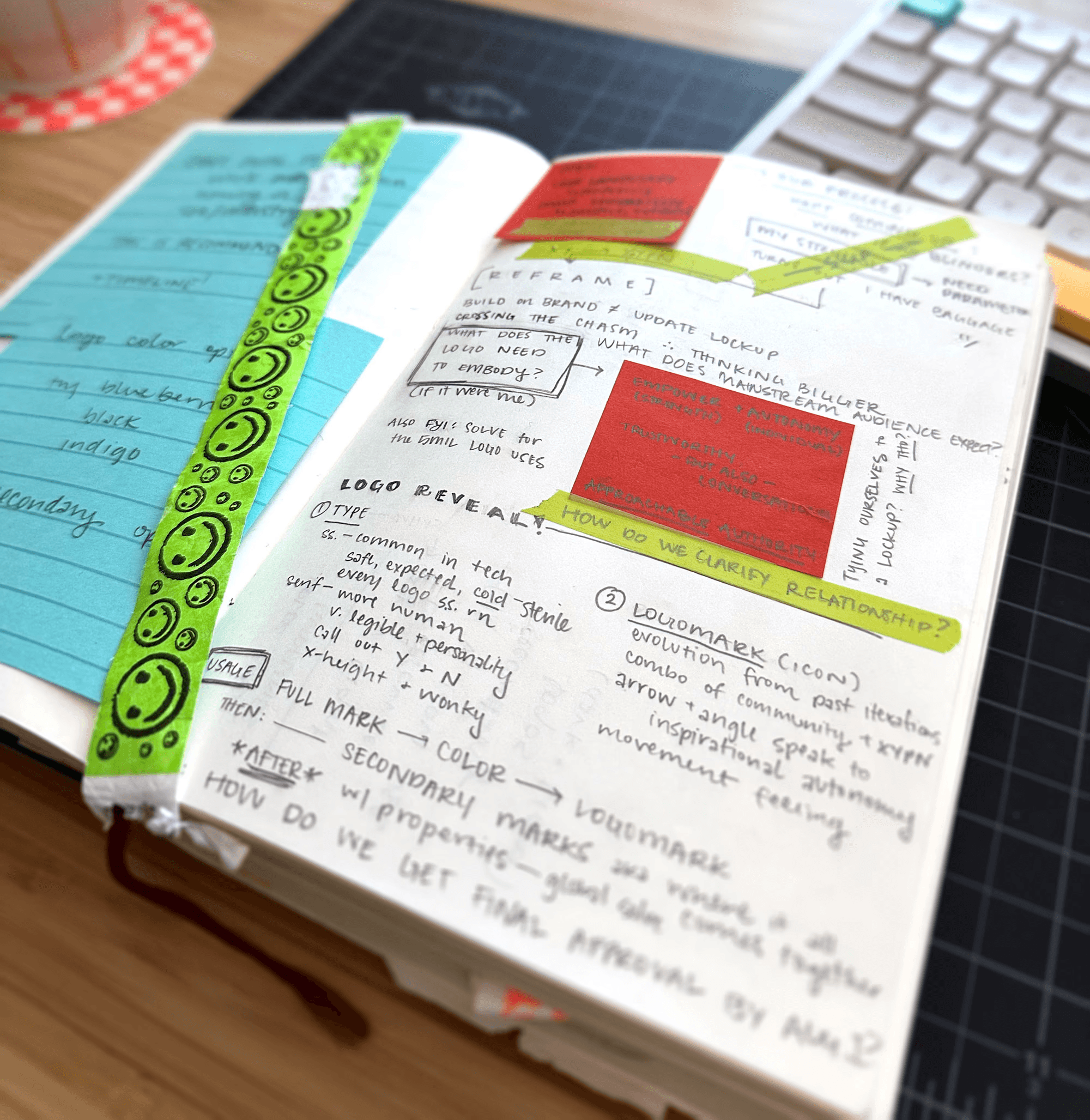
↑ My presentation notes from round five of logo review


Impact
With a fresh strategy, modern identity system, redesigned website, and countless new and updated brand collateral pieces, the brand is virtually unrecognizable from a year ago, much less its 2014 roots. In a six-month retrospective, the Marketing team saw major improvements:
Time on page increased 8%
Brand new contacts increased 17% while new contacts from organic traffic increased 9%
Marketing Qualified Leads increased 10% while Sales Qualified Leads increased 14%
Three new branded content campaigns resulting in 43,000 web sessions
Conversations with future members shifted from ‘What is XYPN?’ to ‘How can XYPN help me start an RIA and what is included in the compliance offering?’
— Feedback from the Sales team post-refresh

↑ Aforementioned Sales team, enjoying the new brand extensions


