Royal 7
Royal 7 Motel
// Identity + Collateral
The Royal 7 Motel’s history as comfortable, convenient lodging for locals and tourist alike necessitates a refresh of the brand’s stuffy, outdated, and eclectic visual identity. The updated brand thrives on juxtaposition, much like the contrast inherent in the motel’s goals to be both central to Bozeman and a comfortable retreat, individual in its treatment of guests while maintaining a friendly, community-centered approach.

typography
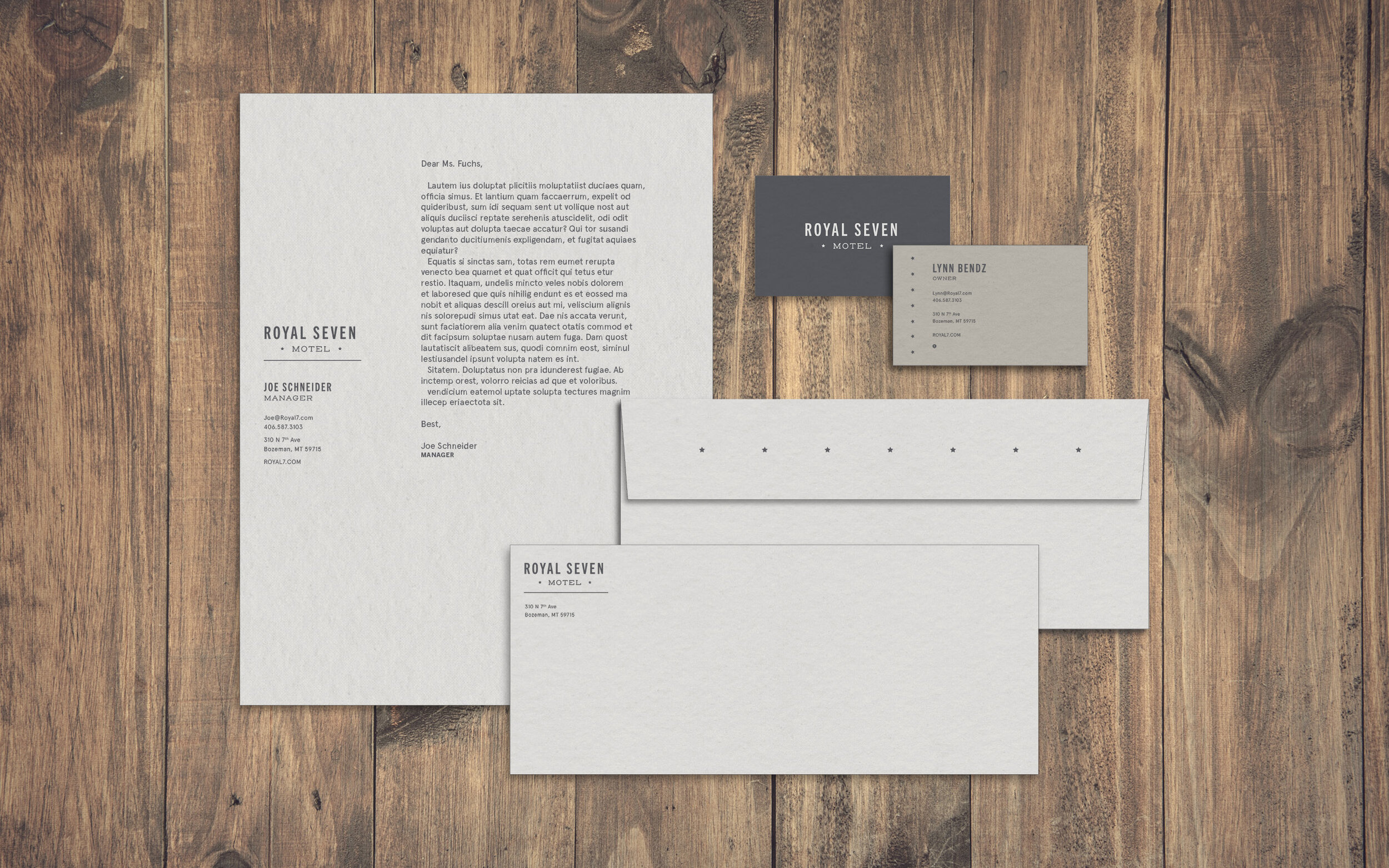
The use of the Trade Gothic typeface, a grotesque serif originally designed in 1948, communicates a hard-working, open demeanor while Henderson Slab, based on the geometric type design of early twentieth century sign painted lettering, contrasts in both curves and proportions.
Color + Pattern
The colors, too, are meant to elicit an understanding of the motel as established and reliable through the use of navy and a palette of grays, while also clean and modern in the tertiary pear green and sky blue. Because visitors to the Royal 7 are looking for conveniently located, reasonably priced lodging, the brand needs to communicate an honest and down-to-earth personality. The use of stars, a classic, simple homage to Western cowboy culture, helps conjure up a straightforward, salt-of-the-earth mentality.
The updated brand thrives on juxtaposition, much like the contrast inherent in the motel’s goals to be both central to Bozeman and a comfortable retreat, individual in its treatment of guests while maintaining a friendly, community-centered approach.
